Customization

Author

Shifa Maqsood

library(tidyverse)   # data wrangling functions
── Attaching core tidyverse packages ──────────────────────── tidyverse 2.0.0 ──
✔ dplyr     1.1.0     ✔ readr     2.1.4
✔ forcats   1.0.0     ✔ stringr   1.5.0
✔ ggplot2   3.4.1     ✔ tibble    3.1.8
✔ lubridate 1.9.2     ✔ tidyr     1.3.0
✔ purrr     1.0.1     
── Conflicts ────────────────────────────────────────── tidyverse_conflicts() ──
✖ dplyr::filter() masks stats::filter()
✖ dplyr::lag()    masks stats::lag()
ℹ Use the ]8;;http://conflicted.r-lib.org/conflicted package]8;; to force all conflicts to become errors
library(ggthemes)    # for themes
library(patchwork)   # for combining plots
library(plotly)      # for interactive plots

Attaching package: 'plotly'

The following object is masked from 'package:ggplot2':

    last_plot

The following object is masked from 'package:stats':

    filter

The following object is masked from 'package:graphics':

    layout
library(waffle)      # for waffle plots
library(ggbump)      # for bump plots
library(treemap)     # for treemap plots
library(ggwordcloud) # for word clouds
library(tidytext)    # for manipulating text for word clouds
library(sf)          # for mapping geoms
Linking to GEOS 3.10.2, GDAL 3.4.2, PROJ 8.2.1; sf_use_s2() is TRUE
library(rnaturalearth) # for map data
library(rnaturalearthdata) # extra mapping data

Attaching package: 'rnaturalearthdata'

The following object is masked from 'package:rnaturalearth':

    countries110
library(gganimate)   # for animated plots
No renderer backend detected. gganimate will default to writing frames to separate files
Consider installing:
- the `gifski` package for gif output
- the `av` package for video output
and restarting the R session
theme_set(theme_light())
ct <- cols(issue_category = col_factor(levels = c("tech", "returns", "sales", "other")))

# load data
survey_data <- read_csv(file = "data/survey_data.csv",
                        col_types = ct)
# create bar plot
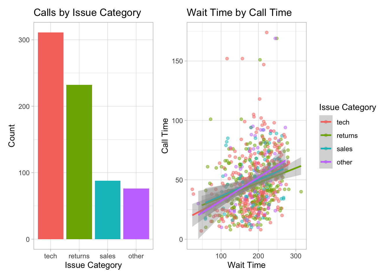
bar <- ggplot(data = survey_data, 
              mapping = aes(x = issue_category,
                            fill = issue_category)) +
  geom_bar(show.legend = FALSE) +
  labs(x = "Issue Category", 
       y = "Count",
       title = "Calls by Issue Category")

#create scatterplot
point <- ggplot(data = survey_data, 
                mapping = aes(x = wait_time, 
                              y = call_time,
                              color = issue_category)) +
  geom_point(alpha = 0.5) +
  geom_smooth(method = lm, formula = y~x) +
  labs(x = "Wait Time",
       y = "Call Time",
       color = "Issue Category",
  
            title = "Wait Time by Call Time")
bar + point

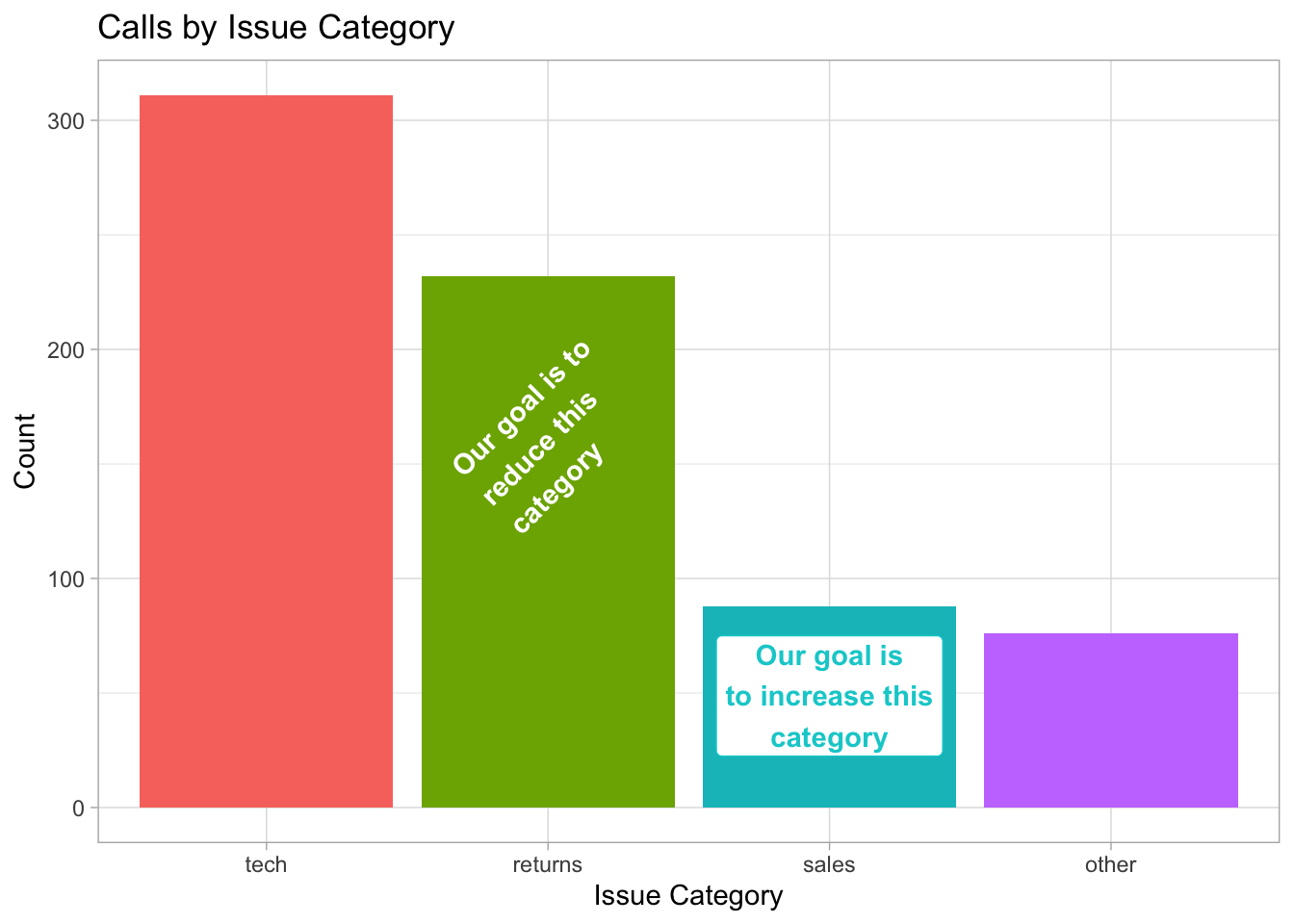
bar +
  # add left-justified text to the second bar
  annotate(geom = "text",
           label = "Our goal is to\nreduce this\ncategory",
           x = 1.65, y = 150,
           hjust = 0, vjust = 1, 
           color = "white", fontface = "bold",
           angle = 45) +
  # add a centred label to the third bar
  annotate(geom = "label",
           label = "Our goal is\nto increase this\ncategory",
           x = 3, y = 75,
           hjust = 0.5, vjust = 1, 
           color = " darkturquoise", fontface = "bold")

survey_data <- read_csv(file = "data/survey_data.csv",
                        show_col_types = FALSE)

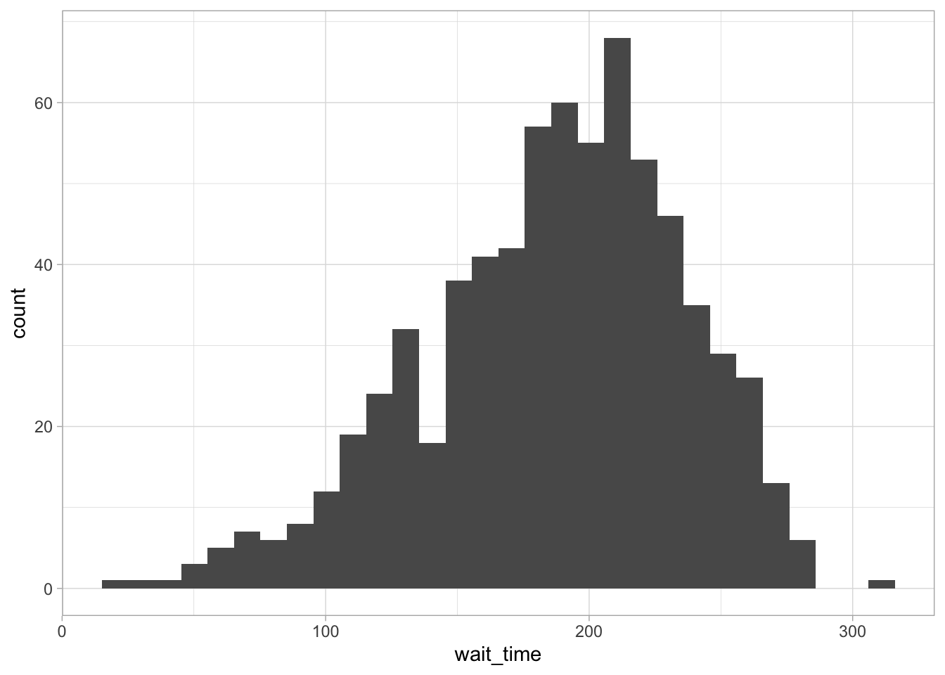
ggplot(survey_data, aes(x = wait_time)) +
  geom_histogram()
`stat_bin()` using `bins = 30`. Pick better value with `binwidth`.

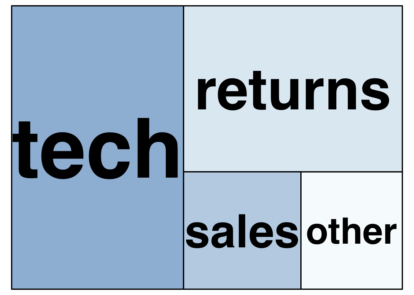
survey_data %>% 
  count(issue_category) %>%
  treemap(
    index = "issue_category", # column with number of rectangles
    vSize = "n", # column with size of rectangle
    title = "",
    palette = "BuPu",
    inflate.labels = TRUE # expand labels to size of rectangle
  )